Using Data Visualization and Infographics
Data is great for backing up your claims or telling a story about your product’s ROI. But how can you display it in a way that makes sense to your audience?
Try to imagine one word that sums up the evolution of our business, culture, and technology, over the past 10 years. While there are many options, such as ‘internet’ or ‘digital,’ there is perhaps none more emblematic than ‘data.’ Can you think of anything in your life that hasn’t been affected by the data revolution? If so, it’s probably a smart idea to plant your flag there, because there are doubtlessly other people thinking about entering and disrupting that space.
We have all witnessed the ways that data can be used to enable smarter targeting, better decision making, and the optimization of services to tailor products to specific users in real time. However, the power of data can also go a long way on the customer-facing side of marketing.
This involves leveraging the spectrum of data to create easily interpretable and powerful snapshots, which can simultaneously inform, persuade, and affect. With social media as the main avenue between customers and companies, shareable images are more important than ever. These images need to stand out from the stream of images, and provide value. They need to be well-designed and make an intuitive point. In this blog post, we’ll look at the main techniques for doing just this: data visualization and infographics.

What is Data Visualization?
Data visualization is a way of utilizing all of the data we have, and making an accessible and intuitive point based on trends within the data, through visual representation. One of the first forms of data visualization was the map, and it will serve as a great example for further understanding.
A map uses data visualization because it translates longitudinal and latitudinal data, all of the messiness of the real world, into a simple model that can be used for orienting yourself in unknown terrain. You are unlikely to see trees or rocks on most maps, because this usually isn’t relevant data to the mapmaker.
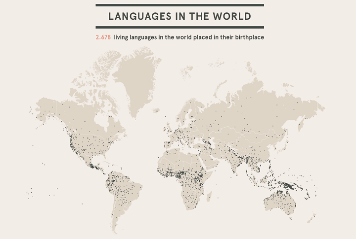
Below, you’ll see an example of a map used for data visualization, showing the geographic origin of all the languages currently spoken in the world. Note that only relevant data (the outline of the continents and the language birthplaces) appears in the graphic. Considering the scope of the data analyzed here, this is an excellent representation of a particularly complex set.
This map, the finished product of the data visualization process, is called an infographic. Infographics are the generalized product of data visualization, and a map is the specific product of location data visualization. They can be directly representational, like how a map resembles the earth itself, but data sets aren’t always so easy to handle. Often, they’re much more abstract, and this requires some heavy lifting on the part of the designer to create a powerful infographic. Let’s take a look at what makes a great infographic.
What Makes a Great Infographic
The saying goes that a picture is worth a thousand words. But, in this equation, how many data points is a picture worth? Well, that depends on the strategy, skill, and execution behind the picture, or infographic. A powerful infographic tells a complicated story in a glace, like the language origination map above. A weak infographic only serves to further confuse the people you’re trying to convert. There are several key aspects any great infographic must have. Great infographics must:
-
Be visually engaging: First and foremost, you need people to look at your graphic before they can understand it. Most infographics appear on social media, so your image needs to stand out in the stream of other content. Bright colors, a clean design, and an intuitive layout are all factors in visual engagement.
-
Make a clear point: Most bad infographics get tripped up on this point. The data sets collected today are so extensive and granular in detail that nearly any point can be taken from them. If an infographic doesn’t make its purpose clear, then it’s up to the viewer to interpret, and this takes the success of your graphic totally out of your control.
-
Bridge the gap between the data set and the viewer: Bringing together the previous two points, a great infographic visually guides the viewer to the desired conclusion, relieving them of doing any interpretive work. By using graphic design expertise to walk the viewer through the point being made, information can flow freely, accessibly, and accurately.
Let’s look at an example of an infographic that nails all three of these: this Google infographic about which devices Americans get their political information from.
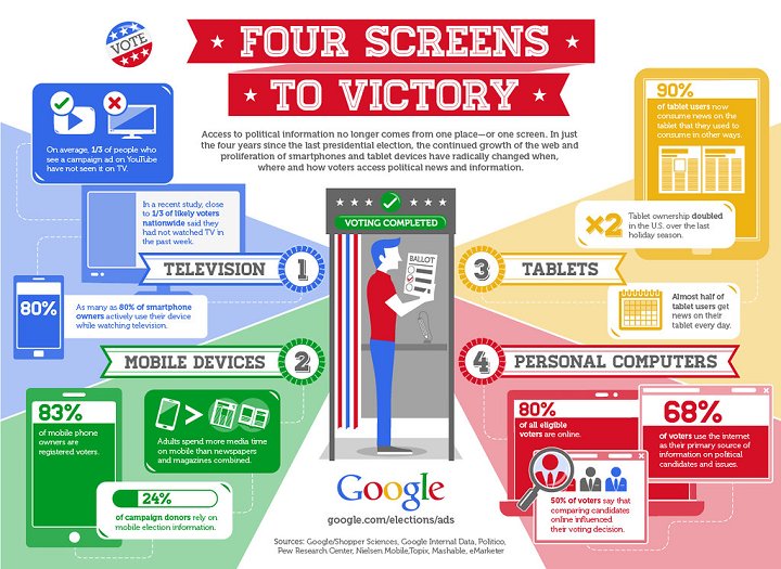
There’s a lot of information here, but it’s spaced out and categorized in intuitive visual groupings, all defined in Google’s iconic branding. With icons used to represent each device, and statistics accompanying these icons, the viewer can quickly and effectively get a grasp on the point being made here. Despite the complicated nature of the subject matter, this infographic crystalizes distinct points about each device, so that a marketer can internalize the information, and apply it immediately. This is a striking success of an infographic, excelling in all the principles of data visualization laid out in this blog post.
We already know that data is powerful. But without a well-designed visual presentation, users will likely miss the point you’re tryin to make. By following these steps and principles for transforming data into digestible information through visualization, you can harness the immense power of data for whatever marketing purpose you need. Once you understand your purpose, and the data sets at hand, it’s time to craft an impressive, intuitive, crystal clear infographic through which you can communicate with your audience.